People that know mw know that I’m a Windows guy. I use outlook.com for email, Bing as my search engine, I have a Windows 8 Phone, I have Windows 8 on my personal computer as well as my work laptop, and I have a Surface RT which was a Christmas gift. Shoot, at work I even administer, provide branding for, and train users in our (Microsoft) SharePoint 2010 environment. Until recently, I had an Office 365 site which I used for testing purposes.
So, one could say I’m pretty invested in Microsoft’s vision for business productivity and entertainment. I have (actual) reasons for why I use these products and services. I don’t pretend that they’re necessarily the best for everyone, but they work fine for me for the most part. The point of this post isn’t to pitch these services to anyone. I can do that later if there’s any interest (doubt there will be)
As I’ve been using these services and seen the evolution of Microsoft’s vision, I’ve become increasingly wary of what they’re trying to do, how they’re trying to to it, and how they’re describing their grand experiment.
So, What is Microsoft Trying To Do?

The first thing I’d like to talk about is exactly what i see Microsoft doing with their “Metro” user interface. I don’t pretend to have the wide view of this, since I’m not a developer, or a full time tech journalist like the estimable Paul Thurrott, Ed Bott or Mary Jo Foley, but I have some considerable experience with the way they’re developing, and I think I see a couple of trends.
“3 Screens and The Cloud” – A Single User Experience
I’m not sure if this is still a motto, but apparently for quite a while the Microsoft vision was to have a consistent user experience across the “3 screens and the cloud.” That is, that they’d have a common user experience on television (Xbox), mobile phones (Windows Phone) and computers (either tablets or PCs) with the newest Xbox 360 updates, Windows Phone 8 and Windows 8, and the deeper integration of the Microsoft Account into all of these things, we’re kind of starting to see that happen.
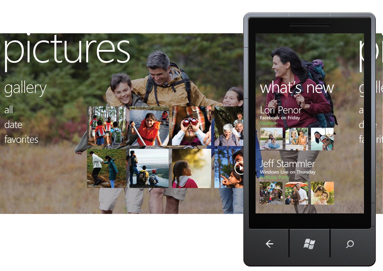
Microsoft’s “metro” user interface, though different in each case, is starting to become the default way users interact with their data, and the documents, pictures, music, contacts, etc that they store in SkyDrive or other is synced across most devices, though some complain that the applications that make the most use of this (like Xbox Music) aren’t really up to par.
My issue with this isn’t really the applications that power the feature.
Convenience Controls
Increasingly, the idea in modern computing is that the OS should get out of the way and let you do what you need to do, while helping with those common functions. Now, one common complaint with the Metro Start Screen interface in Windows 8 is that it, in fact, gets in the way of common work tasks. I’m not sure I agree with this, per se.
Or, at least, I think it for different reasons than most people seem to.
I enjoy the Metro look and feel. I like the idea of panoramic application experiences, and information being delivered to me before I open an application, or in some cases removing the need to actually open the application, but I am starting to feel like they’re not really accomplishing what they set out to do with Metro.

One of my favorite features of Windows 8 is the Charms menu. This takes really common tasks, like configuring application settings, sharing information to email, Facebook, or other applications, and Search, and combining them. I love this feature, since it really feels like the OS is helping me out in kind of an unobtrusive and friendly way. But the rest of it? … I’m going to deal with that in a little bit.
Windows 8 has actually kind of improved my work flow somewhat. The full screen Windows Store “metro style” apps, combined with Live Tiles and toast notifications, let me leave things like email, Skype, and twitter in the background while I’m working, and I can just wait for the toast to see when I’ve got a new email or twitter response. I don’t have to keep checking the application for updates, which is nice, and the reduced visual clutter actually helps me keep from obsessively cycling me through open applications over and over to see what’s new. This might not be for everyone, but I find myself getting distrated now when I’m working and have like, 10 or more windows open on 2 monitors. The “cleanliness” of Metro, both in terms of user interface and when speaking of full screen apps, is growing on me. And hey, if Metro apps bother me, I’m about… a second away from having a gazillion apps open on multiple monitors anyways, right?
Again, not trying to pitch this. Just giving my own use case as a SharePoint administrator and designer.
Issues
My issues with this are actually mostly what I see as not enough follow-through on Microsoft’s part. Live Tiles are (I think) a decent concept, but if the current implementation we see in Windows 8 and Windows Phone 8 is all they’re capable of, how long will they really be useful? I’m going to detail my complaints and hopes and fears in more detail, feature by feature, below.
Ultimately, though, I have to ask: Is Windows 8 really getting out of the way and helping people accomplish tasks, and is Windows Phone really selling a unique value proposition? I’m starting to change my opinions on this, and not for the better.
How is Microsoft Trying To Accomplish This?
Live Tiles

The idea of information being delivered to the user without needing to open an application is a compelling one. Microsoft provides this in the form of Live Tiles. Google/Android and Blackberry, with Widgets. Apple, with that notification thingy in iOS (this is my least favorite implementation, by the way).
But, do Live Tiles really stack up? I mean, iOS can give you a counter for unread items, so the email and phone tiles are only moderately useful there. The Calendar app, and the WP Central app, and large twitter apps, are better, with the ability to deliver some useful information to you, but… it’s not much. Your next appointment, your most recent mention, the most title of the most recent article… How much time is this saving you? I guess it’s good for deciding whether you need to open an application, but I am doubtful of the long-term usefulness of that feature.
To be fair, most To Do list applications, like GoGetter, Clever ToDo, and Clearer (to name a few) pack a ton of information onto their tiles, and these are very nice to have if you like tracking tasks on your phone.
As much as I don’t really like the way Android looks, and have no real inclination to customize the interface myself, it seems like their widgets (as annoying as I’ve found them to arrange to my liking in the limited testing I’ve done) apps like Google Now illustrate the power of this feature in ways that dismay me about the utility of the live experience of my chosen mobile platform. Live Tiles can’t, or don’t do a whole lot. Is this a limitation of the system, or is this simply a lack of experience or imagination on the part of most developers?

Now, one thing I really do like about tiles is their flexibility. Pinning a specific part of an application (like new tweets, or certain sub-categories in news apps) as an application itself is a really compelling feature to me. Contact tiles that let you keep track of someone’s updates, or Map tiles that let you access a certain location and apps related to it (like restaurants and Open Table, or directions to a hotel or back to your car) are awesome. I think one of the more interesting features that Windows 8 and Windows Phone offer is the ability to quickly get you where you want in an app, or combine the functions of multiple apps into a single experience. And speaking of that…
Hubs / Connected Services
One of the features I liked most about Windows Phone 7 while waiting for its development was the Hub. And, conceptually, I still really like it. The idea of a single application, or area, I could go to that combined (for instance) all of my documents, or photos, or contacts, with meaningful information, sounds like a really powerful feature. But Windows 8 doesn’t really seem to carry on the idea of this feature, and Windows Phone 8 seems to have not done much substantial to improve it.
Hubs remain a curiosity where they could potentially be a powerful feature. Sure, having a single spot for games, or music and videos is nice, but look at the People Hub. But, the Facebook and Twitter integration into the People Hub were and remain sadly under-designed, with no sharing of posts, no Groups or Pages support, and more. I just… feel a lot more could be done here to make these Hubs a great way to interact with multiple online services simultaneously. Most of the complaints I hear from iPhone users are how locked into a specific app they are.
Comparing with Other OSes… By which I mean, Android.

Now, these features are great. But where’s the longevity? Where’s the creativity? Where’s the functionality that other OSes aren’t giving people? The narrative that Windows is creating is solid… for now, but are they painting themselves into a corner with Live Tiles and Metro? Where can this go that’s more compelling than Android’s widgets? What’s the Windows narrative that competes with Android? It’s getting harder and harder for me to see, sadly.
I don’t like Google. I don’t really trust them, I don’t like the look and feel of their services, including Android. This is personal, I’m not saying anything broader about it’s quality. It’s just not appealing to me in the way that Metro is. But I can just see Android getting more powerful and useful, and I’m not sure I can see how Microsoft can do this with Live Tiles and its Metro user interface. Which saddens and frustrates me.

I like how thorough this blog is thanks for writing and I enjoyed writing. I’m most interested in your last paragraph, bro.
Google is a behemoth, and they’re doing everything you’ve described here … only better and more deeply embedded with all of their tentacles and apps.
I tell you, sometimes I worry about trusting them … but in the choice between Google, Microsoft, or Apple … I’m going Google.
LikeLike