
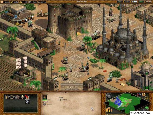
One of the most crucial aspects of the design of any game is its user interface. This is an incredibly broad topic, ranging from the game’s menu system to its in game graphical user interface or HUD (heads-up display) to its interaction model – keyboard and mouse, joystick, game pad, or what have you. A game’s HUD is one of the most basic and most heavily utilized sources of information to the player in a real-time strategy game – many an RTS has been accused of forcing its players to ‘play the UI’ instead of being more free, as in genres like shooters, to interact mostly with the game’s world and environment. The HUD combined with the game’s control scheme (or mouse and keyboard interactions model) encompass the vast majority of a player’s knowledge of and control over the game space, and it behooves game designers to get these systems just right for players, to reach that age old Platonic goal of allowing the player’s intentions to translate directly into action in-game.
Respected RTS game designer Dave Pottinger, now president of indie studio BonusXP, who has worked on storied RTS titles such as all of the Age of Empires games, and Halo Wars, has graciously lent me his ear (metaphorically speaking) and generously lent me his time to answer a couple of questions I had regarding his thoughts as a game designer on this critical facet of the real-time strategy genre.
Wayward: It is my opinion, and tell me if you agree (this’d be a great place to throw in a comment if you were so inclined) that by and large the RTS genre is sticking with known quantities: for the most part, RTS interfaces are comparable to those developed at least 10 or 15 years ago
Dave Pottinger: I think that’s true. 3 reasons:
- Part of that is just that there are less RTS games. Less games means less chance to innovate and see new stuff.
- RTS UI is hard. Improvements for the hardcore are almost always in opposition to improvements for the casual. Just today I decried how we allow you to scroll the camera while drag selecting because it’s terrible for noobs. 3 poeple instantly said “Well, you can’t change that!”. Every genre has those types of tried-and-true assumptions, but few have as much UI as an RTS game. Connecting back to your question, I think it’s harder to innovate when you have so much UI that is established and expected.
- I think RTS UI is something of a solved beast. Back when I started, there was still a debate about one or two mouse buttons. Thankfully, that’s out of the way. But, by and large, the RTS UIs of old were pretty good.
I do fully expect other UI paradigms to come up in RTS games. Absolutely. I can’t wait (and hope to help introduce a few of them). But, I think those need to be accompanied with some game changes. If you have a game that plays like SC or Age, I think you’re going to end up with a UI like SC or Age because that UI works pretty damn well for controlling that type of game.

RTS UI is something of a solved beast
Wayward: At their core, what are your goals regarding real-time strategy interaction models (both with ingame graphical UI and with keyboard/mouse interaction systems)
Dave: At the simplest level, we need players to feel like the UI is allowing them to control the game. Well, maybe that’s not the simplest way of looking at it; whether or not they have fun with the game is probably the simplest metric. Nevertheless, IMO, people get most frustrated with UIs when they are unpredictable and/or they don’t know how to make it do what they want. If I have to answer the “How do I do XYZ? question too often during a playtest, then I know that one’s in the crapper.
So, at the base level, I want a functional UI. Once you learn something, it should be easy to remember how to do it. I personally want a very consistent UI. The UI should also be responsive. That’s not a hard concept, but it can be hard to execute. Many RTS games run a lockstep, synchronous simulation (to push the unit counts so high). That can create difficult situations because the units may not start moving right away when you command them. That means we need to solve the responsiveness issue some other way.
So, at the base level, I want a functional UI. Once you learn something, it should be easy to remember how to do it.
At a higher level, I think an RTS game has a harder-than-average presentation issue… We need to deliver critical info via a split second glance. That’s hard. No one wants to study the gait of a the unit to see if he’s limping when they’re really playing competitively. They need a way to see how much health the unit has at a glance. Hence hitpoint bars.
Bumping up even more, if we can solve the functional and presentation issues, then we can start to think about how it does that. Does it look good? Does it fit the mood of the game? Is it fun to navigate? Where can we put the little dashes of love that make someone enjoy a UI? I do know some folks who start with the UI and then work backwards. I don’t think that way, so I have to do it this way 😉
Keyboard is similar, but there’s less room/need for excitement and pizzaz. Do I get some response when I hit a hotkey? Does your keymapper work? Great. Move on.
Wayward:What do you think are the primary strengths and failings of RTS user interaction design as a whole? If this is too broad, can you comment on the strengths and failings of a representative game (perhaps one you’ve worked on) + comment on what you would’ve liked to see done differently?

Dave: Broadly… I’m not sure I’d consider any RTS game to have a great UI. I say that because I think there’s simply too much information that you have to present. I do think there are plenty of RTS and RTS-like games that have good UIs given the gameplay they must serve. SC2 and LOL come to mind. But, I still don’t think either of those games is a good UI. Too much info, too geared towards the hardcore.
I also humbly say those things expecting the same critiques to be lobbed at our past work (Age, AOM, Halo Wars) and our current game, Servo. We have a lot of information to show you so that you can make the best informed decision possible. Strategy folks tend to like that. Our job is to present all those things in the best UI possible.
I’ll mention two specific fails…
The “giant” Age of Empires 3 UI. It wasn’t really *that* big, but once the game was out, it was instantly lampooned. It surprised us. We had spent so much time arguing/debating/redoing that UI; we just never really noticed that it had gained too much size. We burned all of our energy and time trying to make everyone happy; I don’t think we were ever able to step back and evaluate it from a fresh perspective. So, when that reaction hit, the AD for the game (Dave Kubalak) and I sat down and just did the mini version that night without asking anyone’s opinion. Went out shortly after.
The SelectAll button from Halo Wars. I hated it then and still hate it now. It was such a cave against the fact that we just couldn’t make the UI work well enough. We couldn’t get control groups to work the way we wanted and we were out of time (being that the studio was getting closed and all). We added it to make the game “as playable as possible”. It instantly had the expected effect. It was so easy to use that it became all anyone ever used. It really un-did a lot of the fine work that went into unit differentiation and special abilities. But, without it, the game wouldn’t have been playable.
Wayward:What is the cardinal sin a designer can commit when establishing an interaction model for a strategy game?
Dave: I think there are plenty:) A few that come to mind…
- Assuming everyone will want to “play like you play”. With RTS games having more UI than your typical game, there’s a bigger chance for failure here. You need a UI that can appeal to people who don’t play the same way that you do. In some cases, you may be on the losing end of preference, too. For example, I don’t personally love the QWERTY-style hotkeys that are the rage today. I understand them, though. I can accept that lots of people like them, too. So, we’ll just have an option.
- Assuming that everyone *wants* to play the way you play. Similar, but importantly different than the previous one. Just because you know the right answer, don’t expect everyone to want the same goal. Everyone has their “limit” in terms of how much energy and effort they will expend in a given game. It’s a huge mistake to assume that everyone will have more fun if they play better. Some folks are okay playing a slower paced game. Let them. Yeah, they won’t win a tournament, but they likely don’t care.
- Assuming that you are actually any good at the game you are making. You are not. Don’t think you are. Find someone who is and watch them play. That will change everything.
Thanks again for your time, Dave!

When it comes to matters or RTS UI, all I can think of is R.U.S.E. I think that game did the UI right by removing away the ‘bar’ entirely (look at games like SC, WC, AoE, etc…). You no longer need a minimap, simply because you could just zoom out and boom, there’s your minimap.
LikeLike
Great article! Is there a part 2 though? It says part 1 in the title, but I cannot find Part 2 anywhere…
LikeLike